


January 22, 2014
5 Tips For Creating An Effective Call To Action
Any best practice website should have an effective call to action (often referred to as a ‘CTA’). For those unfamiliar with the term, a call to action is the path you’d like the prospects who visit your site to go down. For example, you might want someone to enroll in a webinar you’re hosting, or submit a quote request to your sales team. The ultimate goal of a call to action is to ensure you’re getting the most out of the visitors to your website (or websites) and turning traffic into leads. Calls to action are also a very measurable way of determining whether your website is truly performing in the sense that it’s driving new business. So this begs the question - what makes an effective call to action?
1. Use a bold color that contrasts with your overall website color palette
As the goal of a call to action is to encourage a prospect to take a specific action, one of the best ways to do this is to make your CTA stand out using color. For a CTA, it’s more about contrast and less about consistency with your overall design. For example, if your website colour palette consists of light blues and whites, consider using a bright orange or bright green colored button. The best thing about color is that it can very easily be changed, so don’t be shy about experimenting. A/B testing of your CTAs will help you determine which color drives the best conversion rates. As a marketer trying to optimize your website and drive leads, you may come up against a situation where a design team feels that bright, highly contrasted CTAs detract from your overall design. But remember that with good analytics you’ll be able to show that the color is driving more leads, which is the goal of your website after all. Here is an example of color contrast on a CTA: 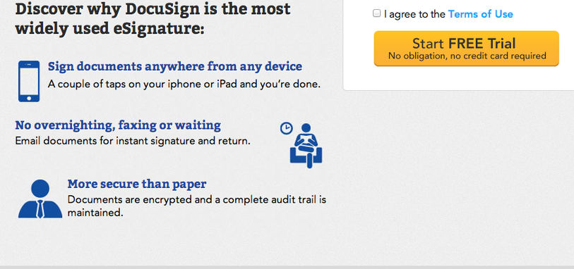
2. Make it high, make it large
When it comes to websites, always place your CTA in a position where prospects are most likely to see it. There’s very little point burying a CTA in a place on your website that is unlikely to be viewed. Remember that many prospects may quickly scan over your website; you often have just seconds to capture their attention. They might also be viewing your website on a tablet or other mobile device. The goal of a CTA is to quickly capture attention; so if the CTA is placed high on your website there’s an inherently better chance of this happening. Additionally, the size of the CTA is important for similar reasons. While it may feel a little out of place at first, like with the color change, you have to keep in mind your overall goal. If this is the one action your want prospects to take, let them know it by making it big enough that they can’t overlook it. Here’s an example of this, notice in particular the size of the CTA in comparison to other elements on the page: 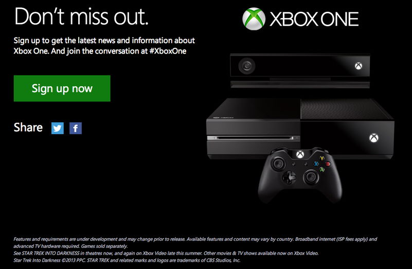
3. Use pressing, direct language on your CTA
It’s very important to be direct in telling prospects the action your want them to take. Language such as “Join”, “Buy now”, “Get an instant quote” all directly encourage a prospect to complete the call to action and increase your chance of a conversion. You can also go one step further and make your CTA more effective by framing your language in more urgent terms (or with a caption), such as “Get a quote (Free before May 29)”.
4. Supplement your CTA with clear reasons why the prospect should complete it
There’s only so much text you can squeeze onto a CTA, and ultimately it’s ideal to keep your message on the CTA itself simple (as discussed above). But it’s also important to remember that it’s likely that a prospect may need some background to your product or service before being compelled to click. Your goal is to help them to understand why clicking on the CTA will benefit them; in other words, what problem are you going to solve? Make your message as clear and concise as possible. In the example below you’ll see that the “Download WhatsApp” CTA is supported by the three core benefits that the app will provide to its users: 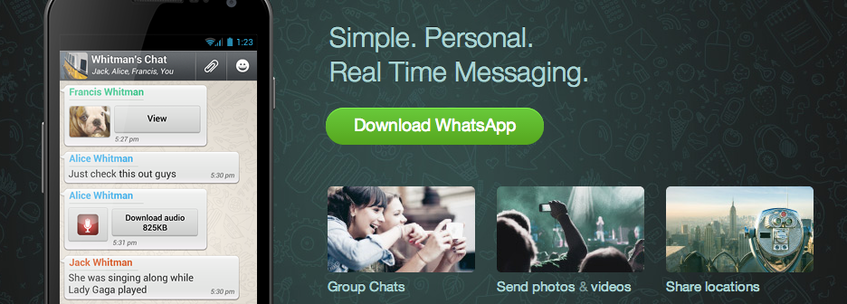
5. Make it an offer they can’t refuse
It’s always beneficial to include an additional reason for prospects to complete your CTA. If they’re hesitating, this might just be the thing that gets them over the line and converts them into a lead. For example, you might offer a discount or a bonus on top of what an ordinary customer would receive. It’s human nature to be attracted to an offer structured in this way. Obviously not all products and services will lend themselves as easily to this kind of offer, so try to be creative when you’re thinking of your offer. Here’s an example of one such offer: 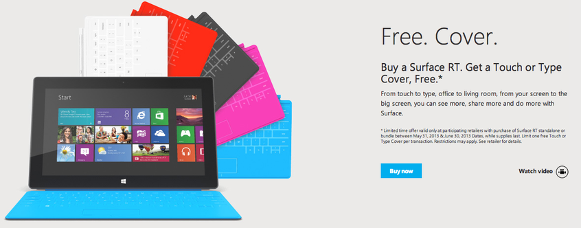
Now it’s your turn!
Ensuring your website contains effective call to actions can be the difference between a successful website and an unsuccessful website. By focusing on both the visual aspects of a CTA, the content they contain, as well as the manner in which they’re framed, you are more likely to turn visitors into leads.


